As the late, great artist James Whistler once said “It takes a long time for a man to look like his portrait.” Whether it be the first self portrait you do in kindergarten or the photo put in the paper for your obituary, modern culture isn't as much interested as who you are currently, rather the embodiment of what you leave behind. With this in mind, the embodiment of myself I wanted to leave behind with the foreshortened self portrait I have created for this project is one of introspectiveness, alienation, and thought. In order to do so while also fitting the criteria of a foreshortened figure, I decided to draw a monochromatic portrait spacing out in a full color rendering of my room. The use of pastels and charcoal as the medium was chosen not only due to a nostalgic urge to return to the drawing board I have long forgotten, but as also a means to add a more personal and textured feel to the project as a whole. While working on the project, having pictures to work off of was a really big help for that it took all the guess work, the only con being the lack of realistic shadows which is a drawback in the final product in some areas. In the end though, I am overall pleased with the end result for that the contrast between the figure and the environment is strong and the shading of the skin and sweater are for the most part realistic.
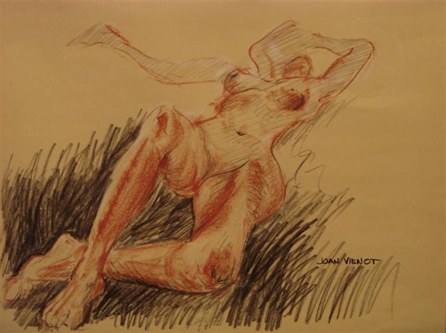
(PICTURE TO BE ADDED POST CRITIQUE)
Monday, November 24, 2014
Tuesday, November 4, 2014
Self Portrait Proposal
In order to meet the criteria, I will create a self portrait through exaggeration by choosing a a perspective that forces the body in to a elongated form. To do so I either plan to continue down the painting pathway by using oil paints or stepping it up a bit and go back to my drawing roots and use charcoal or some ink. The other big idea is perhaps making a print of sorts and etching the entire portrait. With this in mind, I wanna have my piece be me laying across my floor staring up at my ceiling fan with the point of observation taking place from either a hand or the top of my head. I feel this is a significant area for me for that as time moves forward and friends and family continually dip and bend and change, I still come back to my room and feel, even for the smallest of time, able to be totally stagnant in time, letting the world around me stop almost instantly with only my ceiling fan reminding me that I'm still alive. This will surely produce some exaggeration for that by having one part extremely close and large, it forces all other parts of the body to shrink and mold around the initial body part. The composition will stand out for that there will be very sharp contrast between cloth, walls, skin, and carpeting, along with the framing of the piece following the rule of thirds. In the end I'm excited to see what my skill level is able to create from the high hopes I have set in my mind.


Nature Scape/City Scape Final Report
Hwæt! We as a society are in a constant battle between machine and nature. From the grass suffocating on the dark and tumultuous concrete to the skies once an infantile shade of periwinkle, now a murky, discolored mass of chemicals bundled in clouds of smog and industrialism. That being said though, I honestly love the city life and would rather have the dank and smokey fog of commercialism swaddle me in warmth(and lung cancer) before ever stepping foot into a large forest type area or a boring park. With this in mind, choosing a city scape to create using the medium of collage was truly easy as I had just gotten back from Saint Norbert's and stopped at a home away from home, Ear Wax Records in Madison. While any record store is comfy to me, Ear Wax Records is something on a completely different level of appeal and overall soothingness for that the store chock full of Death Metal, Grindcore, Heavy Metal, Harsh Noise, and other merchandise that evokes the little rebellious twelve year old who wanted to learn how to skateboard but never did due to the fact that skateboards were too expensive and he was too fat and ill-coordinated to ever pick it up as a hobby. In order to pay tribute to this gem of a store, I began by sketching out the design on a plank of wood, then going on to finding the correct shades of paper, and then finally layering and modge-podging the whole thing together. The process was overall enjoyable yet tedious for that nothing was stagnant or pasted down till the very end for that layering needed to be free flowing until all the parts were established and cut out. The result of this process I would say is very flashy and portrays the record store in a good light for that the store itself is a mishmash of multiple counter-culture items and doohickeys.
As the subjectively easier project became finished, I began working on the ever-elusive naturescape. From the beginning I wanted to portray a supposedly calm scene, but when looked into a sense of taboo or stress was induced. With this in mind, I began searching through various wartime naturescapes including Dresden, Vietnam, Hiroshima, and finally Afghanistan. While researching Afghanistan, I came across numerous photos of poppy plants, reminding me of Vonnegut's’ Tralfamadorians seeing as they were stalky, bulbous, and an unearthly shade of green. Along with the taboo of the opiated nature of the plant, the Vonnegut connection made it clear what I wanted to create a piece about. Getting to work, I used oil paints on a wooden surface, seeing as I wanted to embrace nature I thought why not use a more rustic approach in terms of a canvas. During painting I found a major pickle had been formed through the process of working on wood for that with such a porous material the amount of paint required often needed to be doubled which invoked the ever tedious job of matching shades of nonexistent paints. With the piece now completed, I enjoy the piece for that it is much looser in stroke than my usual work which I hope to continue for that I feel that is something that brings the quality of my work down from time to time.


Monday, October 20, 2014
Free Choice Write Up
For the first free choice project of the year I wanted to chose an topic that close to home: neigh a topic that IS home. The ever elusive inspiration for this past project was myself, or should I say shades of myself, for that while I wanted to do self portraits I also wanted to create unique beings wrapped around the common place aura that is Sam Knepprath. In order to stretch my ideas to the max and push myself in terms of concept and craftsman ship, I started researching chilling paintings of the past and was astounded at the amazing works of macabre art by one painter Ken Currie, specifically his piece The Gallowgate Lard. Within this interesting piece of work is a multitude of intricate shades of white and purples which gives the encompassing composition an alien yet commonplace feeling of facial recognition through its insane amount of detail. With this painting in mind, along with the abstract works of Pablo Picasso, I began to create my two dissociative self portraits. Through the process of the project I used a mirror and various light sources to capture the essence of the pieces I was inspired by. In the end, I am very proud of the pieces I created within the time span of three weeks for that they do somewhat look like me which is a achievement in itself.


Monday, October 6, 2014
Field Trip Aftermath
This past Thursday, the AP Art crew went down to the Third Ward for a pretty creative journey of downtown Milwaukee for that besides the ever-enjoyable stores ad food surrounding the area, we got to visit the one and only Milwaukee Institute of Art and Design. While visiting the university, we were assigned the task to find three works that truly inspired us. These are the fruits of the assignment:


Along with the trip to the institute, we were given a large block of time to roam free in the downtown area on a quest to find other randomly inspirational items. From this block of time I found the following:


The first two pieces of work that I found intriguing were based around the same project which described to me was to use up an entire pen on a single drawing. With such an odd project proposal, seeing both of these detailed and multi-textured works lit an inspirational flame for that I'm currently in the process of experimentation with pens. The things I like about these two pieces are that they are very rich repetition, value, harmony, and most of all texture for that the spaces are configured in very unique ways giving a eye grabbing effect. The other thing I learned from the fist two pieces, specifically the second piece, is the use of white pens for that the end result added a pop of vibrancy to what could have been an overall boring background otherwise. In terms of the third piece that I chose for this assignment, the reason for its selection was its confusing brush strokes and radiant color pallet unifies the ever challenging goal of achieving a level of abstractness without coming across as pretentious or throwing the term on art done lazily. Unfortunately both titles and artists were not displayed anywhere near these pieces, but if anybody knows either or for any of these pieces I'd love to give credit where credit is due.
The first two pieces were found in some of the galleries our class toured during our visit and stood out to me for various reasons. With the first piece "PB&J" by Darren Mauer called out to me due to the immense amount of detail brought out with simple paints. Along with that the overall color choice and use of simplistic backgrounds really help make the sandwich the main attraction. The second piece was one I was ready to purchase if I wasn't a lowly highschooler without a income worthy of high culture works of materialistic desire for that I truly am jealous of the skill put forth by artist Kenn Kwint through the Picasso-eque portrait. With this along with the physical texture is the radically sick and diseased color pallet which I'd love to incorporate in a later self portrait. While the final thing isn't a art piece per-say, it was a magazine that advertised and projected some amazing modern artists, including perhaps my new favorite artist Cleon Peterson. I don't know where Cleon Peterson has been all my life as a illustrator for that I love everything about his work from the cartoony yet realistic figures to the amazingly dramatic contrast that comes from the use of a binary color scheme. In the end, while only a simple magazine, the discovery of this artist made the whole trip an amazing success in terms of creativity and overall enjoyment.
Thursday, September 18, 2014
Post Critique Reflection
In times of stress and exaggerated goals comes mastering of improvisation and overall multitasking. This has never been more true than with the last project of the weeklong random word portfolio. Through this project I have created 10 works of art based around the word sagacity, meaning to be sagacious or well minded. To handle such a large order in such little time the need to stay after school or come in during resource became a necessity. But through these extra times of work came an excess of creativity for that in these times of stressful thinking came my best ideas for work as well as unique ways of creating said ideas. From these late sessions came the idea for collage which added a whole new level of layering and color pallet for that I could only use the specific colors of paper at hand. In the end I'm overall very satisfied with the weeks worth of work and though through the use of pastels some details became blurry, I feel the overall portfolio was a success.


Monday, September 15, 2014
WORD PROJECT RESEARCH
In order to truly understand and develop a cultured portfolio around my secretive word, I did some research on the definition as well as examples of the word in modern society.
Here are the websites that I found the most helpful:
http://www.arkansas.com/outdoors/golf/ - Found some good nature-scapes.
http://www.mccormick.com/Spices-and-Flavors/Herbs-and-Spices/Spices - Found some good still life ideas
http://www.buddhagate.org/ - Gave some insight in terms of definition and examples of my word.
Subscribe to:
Comments (Atom)